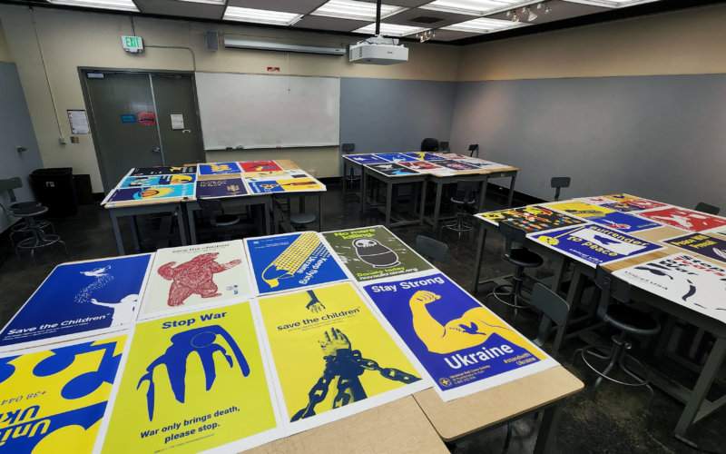
This summer, design professor John Drew gave his ART 483A (Special Studies in Graphic Design) students an assignment: create fully accessible posters promoting peace in Ukraine. Students were required to use tools, techniques, and principles for accessible design to enable visually impaired, colorblind, and dyslexic individuals to fully experience the finished posters. They were also tasked with finding established nonprofits working in support of Ukraine to offer them their finished artwork for use in a fundraising campaign.
By designing with visual impairments in mind, students were able to better understand the everyday challenges disabled people face as well as the considerations designers must make in creating accessible designs. It is estimated that 22.5% of adults in the United States live with some form of disability; of this percentage, 19% are visually impaired, colorblind, or dyslexic.
Below are the “Big Six” principles for accessible design visualization:
- Know the intended target viewing distance of your design.
- Measure color for both contrast standards and distance.
- Measure the letterforms and/or font(s) for distance.
- Measure photo color contrast.
- Use the principles of photo/illustration minimalism by eliminating unnecessary signifiers.
- Set type for those with dyslexia.
As another aspect of the peace poster project, students collaborated with Spyder Lab, a graphic media production studio in the city of Brea that provides area high school students with Certified Technical Education training. Spyder Lab then recruited students from four local high schools to print the posters on-site.
This project proved to be uplifting for both the designers of the accessible posters and the high school students who printed their work. The high school students were inspired to further their education through direct exposure to high-level university graphic design while the designers were able to visualize how their meaningful artwork could function as part of a larger global narrative.